


Choosing What Color to Paint Your Exterior Chimney
January 9, 2024What Is Making My Paint Fade? Top Causes & Fixes
February 7, 2024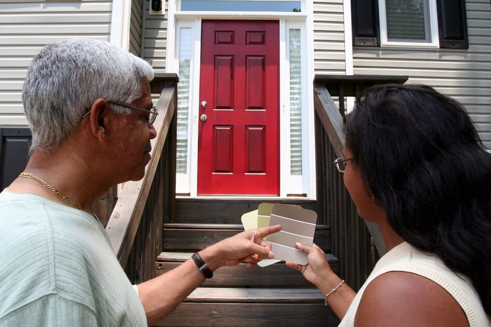
Picture the last time you strolled through a neighborhood, taking in the array of homes lining the streets. One thing probably stood out: the front doors. They’re not just entry points; they’re statements.
A splash of color on your front door does more than just catch your eyes; it tells a story about who lives behind it. We’ve got fresh ideas to help make that first impression count.
You’ll get insights into how colors can stir emotions and set moods, what’s turning heads this year, and tips for picking hues that play nicely with your home’s design. And because we know practicality is key, we’ll cover durability too.
So buckle up! By the end of our colorful journey together, you’ll have all you need to turn your entrance into an expression that’s uniquely yours.
Table Of Contents:
- The Psychology of Front Door Colors
- Trending Front Door Colors for the Current Year
- Choosing a Color Based on Your Home’s Architectural Style
- The Impact of Natural Light on Your Front Door Color
- Color Durability and Maintenance Considerations
- Coordinating Your Front Door Color with Exterior Elements
- The Role of Contrast and Visibility in Color Selection
- Seasonal Color Considerations for Your Front Door
- Cultural Significance and Regional Preferences in Color Choice
- Incorporating Personal Style into Your Front Door Color Choice
- FAQs in Relation to Color Ideas for Your Front Door
The Psychology of Front Door Colors
Ever wonder why some front doors just seem to pop? It’s not magic—it’s psychology. The color you paint your door does more than show off your style; it taps into our collective emotions, setting the mood before we even step inside.
Bright reds are like a confident handshake, welcoming guests with energy and enthusiasm. There’s science behind this: studies suggest that red can raise blood pressure and heart rate, igniting excitement. On the flip side, cool blues give off calm vibes—think of them as a serene “hello.” Blue hues can actually lower stress levels, making visitors feel at ease from the get-go.
Then there’s green—the zen master of colors—which brings balance by blending the cheeriness of yellow with blue’s tranquility. But if you’re looking for something that screams ‘chic,’ black is your go-to. A black door whispers sophistication and often signifies order (and let’s be honest—who doesn’t want to look like they have their life together?). Plus, who could ignore the timeless elegance it adds?
If you’re about to grab a brush but still on the fence about which hue suits your home sweet home best, think about what feelings you want to evoke when someone crosses your threshold because, yes, folks—a lick of paint really holds that much power.
Trending Front Door Colors for the Current Year
When it comes to giving your home a fresh, modern look, nothing says ‘hello’ quite like a vibrant front door. This year’s trends are all about making bold statements and showing off your style.
Bold Blues and Greens
The classic red door might be taking a backseat as deep blues and greens gain popularity. Think navy or forest green that brings depth while still playing nice with most exterior color schemes. They pair well with neutral sidings or brick facades, adding just the right amount of pop without overwhelming the senses.
Not only do these colors scream sophistication, but they also withstand the test of time — meaning less frequent touch-ups for you. So, if you’re eyeing longevity alongside style, these hues could be your best bet.
Sunny Yellows and Warm Oranges
If there’s any truth to color psychology suggesting happiness is tied to certain shades, then sunny yellows are surefire winners. Paired with white trim or soft gray siding, yellow doors shine bright in any neighborhood. For those looking for something slightly more subdued yet equally cheerful, warm oranges have been spotted gracing many an entryway.
These tones aren’t shy; they beckon guests inside with open arms and can keep spirits high even on dreary days.
Pastel Pinks and Purples
Gone are the days when pastels were reserved for nurseries alone. Pastel pinks and purples have found their way onto front doors everywhere this year – proving once again that sometimes softer speaks louder than bold does.
Easily complemented by darker accents such as iron hardware or slate pathways, these gentle hues give off an air of whimsy without sacrificing elegance—perfect for anyone wanting to stand out from their neighbors in a subtle fashion.
Key Lesson:
Revamp your home’s vibe with a trendy front door color. Go bold with deep blues and greens for lasting style, or choose sunny yellows and warm oranges to spread cheer. Fancy something gentle? Try pastel pinks and purples for whimsy with elegance.
Choosing a Color Based on Your Home’s Architectural Style
Your home’s architecture tells a story; the front door is its engaging first sentence. Imagine Victorian homes with their ornate details; they practically beg for deep, rich colors like burgundy or forest green to match their grandeur. On the flip side, sleek modern homes often sport bold statements in black or red that shout ‘sophistication’ from blocks away.
If you’re nestled in a cozy Craftsman bungalow, earthy tones like sage or amber can bring out those lovely handcrafted woodwork features. And let’s not forget about Colonial style—classic white doors are timeless, but don’t be afraid to go navy blue for a twist of elegance that whispers ‘history’ each time you step through the threshold.
For every architectural style, there’s an ideal palette waiting to be discovered. So before you grab your brush and start painting your door willy-nilly, take some time to research what hues harmonize best with your home. It’ll make sure your house isn’t just another face in the crowd but rather one that stands out because it respects its roots while still keeping up with today’s trends.
The Impact of Natural Light on Your Front Door Color
Ever noticed how your front door can look like a different shade at various times of the day? That’s because natural light plays tricks with colors. On a bright sunny day, bold hues might scream for attention while softer tones bask in the glow, radiating warmth and welcome.
Sunlight isn’t just sunlight. Depending on whether your door faces north or south, you’ll get very different vibes. South-facing doors soak up rays all day, which means colors can fade faster but also appear more vividly; it’s where deep blues or rich reds really pop. North-facing entrances receive less direct sun, so cooler shades like sage green or lavender may feel right at home there.
But let’s not forget about east and west orientations—morning light brings out the brightness in yellows and oranges that could make early risers even chirpier, whereas an afternoon sunset warm palettes ablaze with intensity as if saying goodbye to the day in style.
If picking paint feels puzzling due to these shifting spectrums of light, consider checking out how other homeowners select their shades. It might help spark some inspiration.
Color Durability and Maintenance Considerations
Picking a color for your front door is like choosing a silk tie; it’s not just about the hue but also how long it’ll look dapper in the face of weather’s wear and tear. Let me spill some tea on what makes certain paints outlast others.
Satin finishes; my friends are the unsung heroes when battling against Mother Nature’s mood swings. They have this nifty way of shrugging off dirt and moisture, much like you’d brush away annoying crumbs from that tie I mentioned earlier. You can learn more about the perks of satin finishes here.
Now, while glossy might seem all flashy and fancy, it’s actually tougher than old boots – resisting scuffs with an attitude.
But let’s talk about colors because they’re not all created equal under the sun (literally). Lighter shades tend to be forgiving with dust or imperfections, whereas dark colors can show every speckle unless cleaned regularly – something to think about if scrubbing isn’t your idea of weekend fun. Want to know which hues hold up best? Check out this guide on enduring paint choices.
Beyond fashion statements lies practicality; consider UV rays’ effect on pigments over time – yep, they’re as harsh as reading texts without emojis. Dark tones absorb more heat, which may lead to quicker fading unless you opt for high-quality fade-resistant options. On that note, always remember: investing in premium paints pays off, saving both touch-up time and coin down the road.
Coordinating Your Front Door Color with Exterior Elements
Think of your front door as the cherry on top of a sundae—it’s that pop of flavor that ties everything together. But choosing the right color is more than just picking your favorite shade; it’s about creating harmony between all exterior elements. The trim, shutters, and roofing are like backup singers to your lead vocalist—the front door.
To start off on the right foot, take a cue from your home’s existing palette. If you’ve got cool undertones in your roof shingles or brickwork, consider blues or greens for a seamless look. For homes wrapped in warm tones—think sandy stones or clay tiles—a fiery red or sunny yellow can be striking without clashing.
Moving beyond colors alone, let’s talk finish. A high-gloss paint doesn’t just shout confidence but also plays nice with natural light bouncing off its surface—an instant boost for curb appeal. On the flip side (quite literally), matte finishes soak up sunlight, giving an elegant and sophisticated vibe, especially if paired smartly with textured materials like stone veneers.
The key takeaway? It’s not about matching perfectly but rather complementing wisely. By keeping these tips at hand when painting that front door, you’ll ensure every element sings in perfect harmony—making sure passersby can’t help but give it an admiring glance.
The Role of Contrast and Visibility in Color Selection
Choosing the right color for your front door isn’t just about picking a hue that you like; it’s also about how that color stands out against your home’s exterior. Think of it as putting on a bow tie with a tuxedo—it should pop but not overpower.
High-contrast colors grab attention and make your entrance memorable. A bright red or sunny yellow can be like a beacon to visitors, saying, “Hey there. This is the place.” But go too bold without considering your house’s facade, and you might end up with an eye-sore rather than eye candy.
A subtler approach uses complementary colors to create visual interest without shouting from the rooftops. If you have light siding, consider darker shades like forest green or navy blue for elegance that whispers class. On the flip side, pastel doors can soften homes cloaked in dark brick or paint. It’s all about balance—like salt in cookies: strange but somehow perfect.
Beyond aesthetics lies practicality: visibility matters when guests are trying to find your house at night. Colors reflecting more light ensure they won’t miss their turn because they can’t spot the entrance among shadows cast by dusk (or those overcast Portland days). Lighter tones tend to reflect well, so think creams and whites if nighttime navigation is key.
In short, when selecting front door colors for ESP Painting projects—or any project really—contrast and visibility shouldn’t be afterthoughts. They’re critical components that shape first impressions before anyone steps foot inside. So pick wisely; let’s give them something good to talk about.
Seasonal Color Considerations for Your Front Door
Picking a front door color isn’t just about the hue that strikes your fancy; it’s like choosing what tie goes with your suit—it has to be right for the season. When summer rolls in, bright and cheerful colors like sunny yellow or sky blue can give off those laid-back, lemonade-on-the-porch vibes.
Come fall, you might want to swap out that beachy feel for something more akin to pumpkin spice lattes. Rich oranges or deep reds can mirror those gorgeous autumn leaves and make your entryway as cozy as a warm sweater. But here’s where practicality elbows its way into our colorful reverie: changing your door color with each season sounds fun but is about as convenient as juggling flaming torches.
So, let’s talk year-round elegance—colors that look sharp, no matter if it’s snowing or sweltering. Classic hues such as charcoal gray, forest green, or even a stately navy bring timeless charm without seasonal bias. They’re also forgiving when it comes to dirt and smudges, which helps if you’re not keen on frequent touch-ups (because who is?). A good paint job using high-quality products will ensure these shades stay dapper through Christmas carols and Fourth of July fireworks alike.
Cultural Significance and Regional Preferences in Color Choice
It’s not just a matter of taste—it often reflects the cultural heartbeat and regional character. For instance, vibrant turquoise doors can be spotted dotting the landscape of Santa Fe, nodding to its rich Native American heritage.
The Influence of Culture on Palette
In Portland, we see a celebration of nature with earthy tones that mirror our lush surroundings. These choices aren’t random; they’re deeply rooted in our community ethos. Take Japan, for example—there you’ll find reds at entrances because they symbolize good fortune and protection against evil spirits. This color has seeped into their architectural DNA over centuries.
And let’s talk about those iconic blue doors sprinkled across Greece’s coastal towns. They do more than mimic the Aegean Sea—they reflect an age-old belief that blue wards off “the evil eye.” Cultural traditions like these show how history paints our present-day palette decisions.
Regional Trends Shaping Choices
Moving closer to home, think about Oregon’s own pioneering spirit—it encourages boldness even in something as simple as choosing a front door color. The Pacific Northwest is known for its trailblazing ways, after all. Here, we have homeowners embracing shades from forest green to deep berry blues that stand out but still pay homage to natural beauty—a testament to local tastes influenced by environmental elements unique to this corner of the world.
Around here, when people opt for sunny yellows or sky blues on their doors, it isn’t just chasing trends—it could also be them manifesting a little extra sunshine amid frequent gray skies.
Incorporating Personal Style into Your Front Door Color Choice
When it comes to picking a front door color, think of it as the tie that brings your whole suit together. It’s not just about what’s trendy; it’s about showcasing who you are. Maybe you’re all about that sleek, minimalist vibe – so how about a deep charcoal or jet black? Or perhaps your heart sings in technicolor, and only a sunshine yellow will do.
The key is balance. You want your front door to whisper (not shout), “This is me.” For example, if Victorian charm gets you excited, consider jewel tones like sapphire blue or emerald green to echo that era’s elegance. And if mid-century modern is more your jam, why not flirt with pastels? A soft turquoise can give off those retro feels while still playing nice with the rest of your home’s look.
But remember: personality doesn’t mean forgetting that neighbors exist. Sure, go bold with a fire-engine red if it speaks to you – but also make sure it won’t clash with surrounding elements. If harmonizing sounds tricky, Better Homes & Gardens has some great tips to guide you through choosing colors that complement rather than compete.
FAQs in Relation to Color Ideas for Your Front Door
What color is best for front door?
Black doors suggest sophistication; red screams welcome. Choose based on your home’s style and the vibe you want to send.
What are the hottest front door colors for 2024?
Bold blues, earthy greens, and warm terracottas lead the pack this year, reflecting both classic appeal and modern flair.
Should front door be lighter or darker than house?
A darker shade often anchors a home’s look, while a lighter one can give it a refreshing pop. Think contrast.
What color front door adds the most value?
Homes with charcoal, smoky black, or rich jet doors could see up to $6k more in value – curb appeal counts.
Walk away with this: color ideas for your front door can truly transform your home’s vibe. Remember, colors have power; they shape feelings and perceptions right at your doorstep.
Take note of what’s trending, but don’t be afraid to stand out. Aligning the hue with your home’s style is crucial for that ‘wow’ factor. And light matters – it shifts how a color pops or fades throughout the day.
Pick paints that last and require less fuss over time. Coordinating with exterior elements? It makes all the difference in curb appeal.
Create contrast for impact, consider seasonal shades if you’re into change, and weave in personal flair without clashing with local trends or cultural norms.
You’ve got what it takes to make a statement that resonates. Let these insights on color ideas for your front door guide you toward an entrance that shouts ‘you’ before anyone even rings the bell.
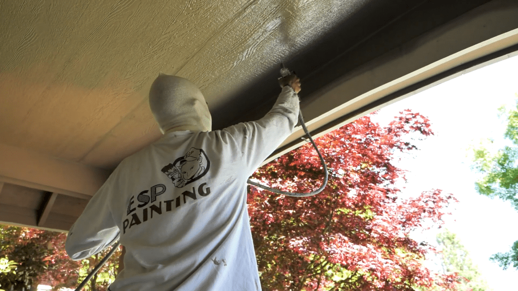
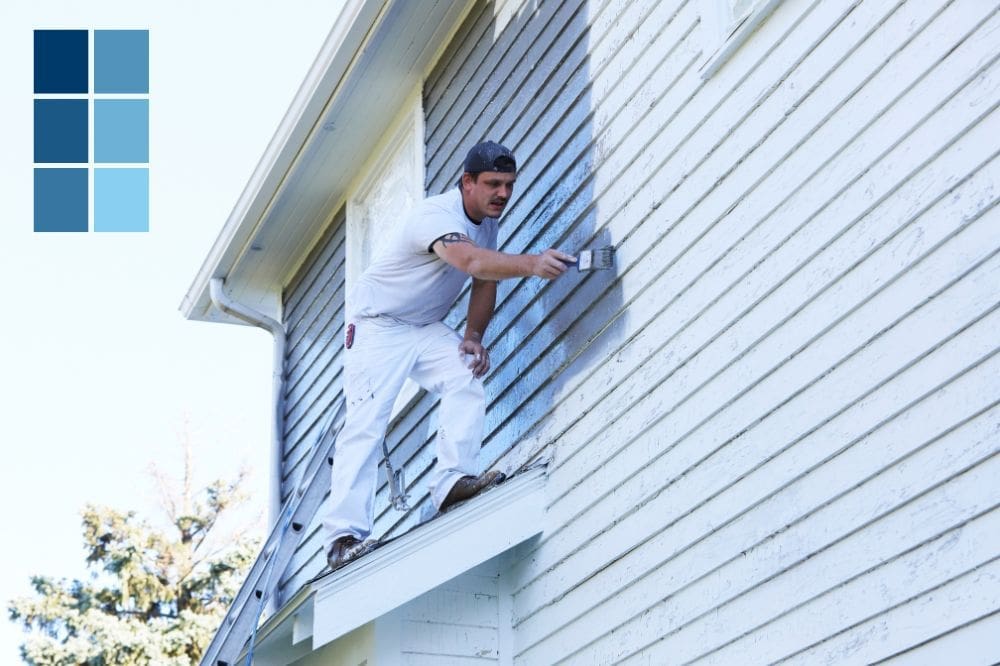
A vivid and well-executed front door color can significantly transform your home’s curb appeal. Whether you’re in Beaverton, West Linn, Tualatin, Sherwood, or Lake Oswego, ESP Painting, Inc. offers expert exterior painting services that will not only beautify your entrance but also elevate the entire aesthetic of your property. Embrace color with confidence and let ESP Painting, Inc. guide your choice to make that first impression truly count. Trust us to deliver a professional finish that stands out, making your home the envy of the neighborhood.

Jeff Sommers is a vibrant and experienced professional, having been at the helm of ESP Painting, Inc. for 27 remarkable years. As President, he has become an esteemed leader in the Commercial & Residential Construction industry in Oregon, United States. His experience has seen him gain valuable insight and knowledge, making him an invaluable asset to ESP Painting and its customers. With a bubbly personality and upbeat attitude, Jeff always looks ahead to the future as he continues his leadership journey toward success.


