
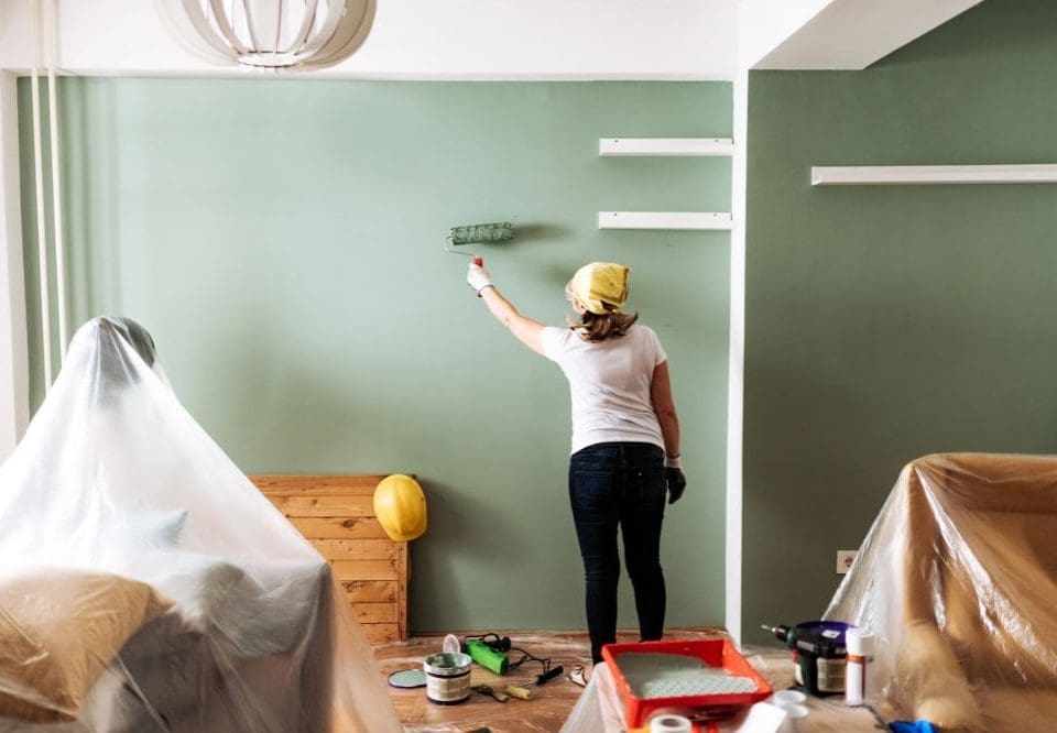
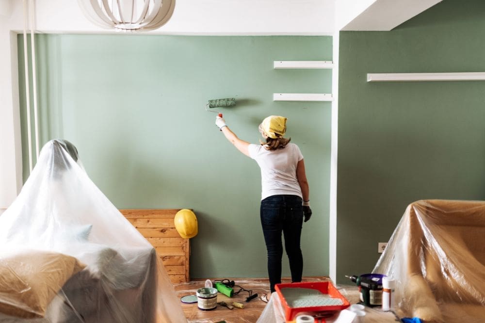
Interior Painting: Prep for Crisp Lines on Detailed Trim
June 1, 2026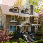
How Sun and Shade Affect Your Exterior Paint Color
July 1, 2026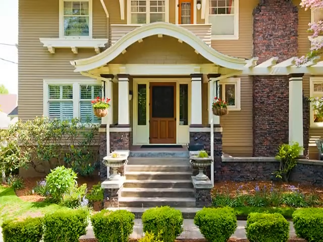
- Lighting Matters: The Pacific Northwest’s frequent overcast skies provide diffused light that makes mid-range colors appear more saturated and “pop,” whereas direct sunlight can wash colors out or add unwanted yellow tints.
- Strategic Testing: To avoid surprises, paint large swatches directly on your home and observe them at different times of day and under varying weather conditions (sunny vs. cloudy) before finalizing a choice.
- Durability & Finish: Due to high annual rainfall and UV exposure, satin or low-lustre finishes are recommended over flat paints because they shed moisture more effectively and retain color vibrancy longer.
- Regional Trends: 2026 trends favor nature-inspired palettes, including warm whites, earthy neutrals, deep greens, and charcoal tones that complement the local landscape and moody gray skies.
Color in Pacific Northwest Light: Warm, Cool, and How to Test Paint
The Pacific Northwest is known for its beautiful, often overcast, skies. This unique lighting greatly affects how exterior paint colors appear on your home. What looks perfect in a sunny showroom might look completely different on a cloudy day in Portland or Beaverton.
Understanding how diffused light changes colors is key to choosing the right exterior paint colors. This guide will help you see how warm and cool tones shift in our region and teach you how to properly test paint for your house painting project.
How Overcast Days Change Color Perception
On overcast days, the light is softer and more spread out. We call this diffused light. This kind of light helps colors look stronger and more true to their original shade. Think of it like a photographer using a softbox to make colors pop.
This is why many colors appear more vibrant and saturated when the sky is gray. The Pacific Northwest, with its frequent overcast days, often showcases this effect beautifully, especially in Portland and Beaverton house painting projects.
Studies show that colors are strongest when they are in their middle value range. As colors get lighter, closer to white, their saturation can lessen. However, under the moody gray skies of the Pacific Northwest, colors like the deep greens of our forests or vibrant flowers can really “pop” against the muted backdrop.
This phenomenon is often highlighted by artists like Richard Schmid and Dan Scott from Draw Paint Academy, who emphasize seeing more color on overcast days. This is crucial for choosing exterior paint colors for your home in Oregon.
Color Appearance: Overcast Versus Sunny Conditions
The weather greatly changes how colors look. On bright, sunny days, strong light can make colors appear lighter and less rich. The sun’s direct rays can even add a warm tint to your exterior paint colors.
However, when clouds spread out the light, like on a typical Pacific Northwest overcast day, this tinting does not happen. The colors appear truer and often more intense. Many colors look stronger and richer under diffused light because the softer light prevents them from being washed out by direct sunlight. This is a crucial concept in understanding color relativity in house painting.
Studies show that colors are strongest at their middle value. Lighter colors can lose their richness in bright sun. This is why a deep green or charcoal paint might look more vibrant against the moody gray skies of Portland or Beaverton than on a sunny day.
Testing Exterior Paint Colors in Pacific Northwest Light
To pick the perfect exterior paint colors for your home in Portland or Beaverton, you need to test them where they will actually be seen. Don’t just rely on small paint chips. Instead, paint large sample swatches directly on your house.
View these samples at different times of day. Check them in the morning, afternoon, and evening. Also, make sure to see them under various lighting conditions, including bright sun, shade, and, most importantly, on an overcast day. This will show you how the color truly shifts and interacts with the unique light of the Pacific Northwest.
Testing paint samples in different lighting conditions, especially on an overcast day, is the most accurate way to see how a color will behave on your home.
How Overcast Days Affect Color Perception
On overcast days, the light is softer and more spread out. This diffused light enhances how well you see colors and increases their color saturation. Colors appear strongest at their middle value, while lighter colors might seem less saturated.
Think of it like this: an overcast day makes colors like the deep greens of trees, the vibrant grass, and bright flowers truly “pop” against the moody gray skies. This phenomenon, known as color relativity, means that colors are often perceived more intensely and accurately under overcast day lighting.
Understanding Warm and Cool Tones for Your House Painting
Knowing the difference between warm and cool tones is helpful for choosing exterior paint colors. Warm tones, like reds, oranges, and yellows, tend to feel cozy and inviting. Cool tones, such as blues, greens, and grays, often create a calming or modern look.
In the Pacific Northwest, with our frequent overcast days, warm whites, earthy neutrals, and even rich ochre shades can help a home feel welcoming and prevent it from looking dull. However, deep greens, charcoal paint, or navy blue paint can also look stunning, especially when paired with contrasting trim or stained wood accents. Consider brands like Sherwin-Williams and Benjamin Moore for a wide value range of options.
Best Exterior Paint Finishes for the Pacific Northwest Climate
The Pacific Northwest climate, with its 43 inches of annual rainfall, demands specific paint finishes for durability. Satin or low-lustre finishes are highly recommended for exterior house painting in Portland, Beaverton, or Hillsboro. These finishes shed rain better and reflect heat, which helps with color retention.
Proper surface preparation is critical for these finishes to perform well. They are more durable and help maintain the vibrancy of colors, even for deep, complex colors like Urbane Bronze and Functional Gray, by resisting fading from the intense summer sun and constant moisture shedding.
Influence of Pacific Northwest Climate on Paint Color Choice
The unique climate of the Pacific Northwest greatly influences paint color choices. The region’s 43 inches of annual rainfall and periods of intense summer sun mean that UV-resistant paints are essential to maintain vibrancy and prevent fading.
This is especially true for deep, saturated color choices. Nature-inspired palettes, like mushroom tones, deep greens, and earthy neutrals, often blend beautifully with the natural landscape of the Cascades and surrounding areas, offering timeless painting inspiration.
Best Exterior Paint Finishes for the Pacific Northwest Climate
Choosing the right paint finish is just as important as selecting your exterior paint colors, especially here in the Pacific Northwest. Our region sees about 43 inches of annual rainfall, so you need a finish that can truly handle moisture and our unique weather patterns in places like Portland and Beaverton.
For exterior house painting, ESP Painting strongly recommends a satin finish or low lustre finish. These finishes are excellent choices because they:
-
- Shed rain better than flatter finishes, protecting your home.
- Reflect some heat, which helps with color retention and keeps your deep greens or charcoal paint looking vibrant.
- Are more durable and resistant to wear and tear, standing up to moody gray skies and intense summer sun.
Proper surface preparation is always critical, no matter the finish. This ensures the paint adheres well and lasts longer, providing better weather resistance for your home in Oregon. This is key for maintaining the rich color saturation you pick.
Influence of Pacific Northwest Climate on Exterior Paint Color Choice
The climate in places like Portland and Hillsboro truly impacts which exterior paint colors work best for your home. Our summers can bring intense sun. This means that UV-resistant paints are essential to prevent fading, especially for deep, complex exterior paint colors like Sherwin-Williams’ Urbane Bronze or Benjamin Moore’s Functional Gray.
The high annual rainfall, averaging about 43 inches, also means your paint needs to stand up to moisture. Selecting high-quality paints designed for moisture shedding and durability is key for any house painting project. Many homeowners are drawn to nature-inspired palettes, with deep greens, mushroom tones, and earthy neutrals. These blend beautifully with the surrounding Cascades landscape and the moody gray skies we often experience.
How Overcast Days Affect Color Perception in the Pacific Northwest
On overcast days, the softer, diffused light in the Pacific Northwest actually enhances how you see colors. This type of light prevents colors from being tinted by direct sunlight, which increases their color saturation. Think of it like a natural light box; everything looks clearer and more vibrant.
Studies show that colors are strongest at their middle value range. Lighter colors tend to weaken in saturation under soft light, but mid-range hues truly pop. This relativity is important: overcast light makes natural colors like trees, grass, and flowers appear more vivid against the gray sky, providing excellent painting inspiration.
Differences in Color Appearance: Overcast vs. Sunny Days
Bright, sunny days in the Pacific Northwest can actually make exterior paint colors appear less saturated. The strong sunlight tends to wash out or tint colors. In contrast, overcast day lighting provides diffused light that prevents this tinting, enhancing the true color saturation of your chosen hue.
Many colors, especially those with good color saturation like deep greens or charcoal paint, look much stronger and richer under overcast light. This softer illumination reveals the full depth of a color, making it a critical factor when choosing paint for your Portland or Beaverton house painting project.
Testing Paint Colors in Natural Pacific Northwest Lighting
To truly see how an exterior paint color will look on your home, you need to test it properly. Paint large sample swatches directly on your house. View these samples at different times of day, making sure to see them in both shade and direct sunlight, as well as on an overcast day.
This method helps you accurately assess how the color shifts throughout the day and under various lighting conditions unique to the Pacific Northwest. Observing how a color interacts with the diffused light and bright sun will prevent surprises and ensure you love your final choice.
2026 Color Trends for the Pacific Northwest
For 2026, the trend for exterior paint colors in the Pacific Northwest continues to lean towards nature-inspired hues. Warmer whites and rich, earthy neutrals are very popular, moving away from starker grays. You’ll also see an uptick in deep greens, charcoal paint, and even moody plum shades and terracotta paint.
These colors, like deep greens from Sherwin-Williams or Benjamin Moore, reflect the natural beauty of Oregon and Washington. They provide a sophisticated yet inviting feel, working well with the diffused light of our region and offering excellent color saturation for a truly saturated look. You might also see navy blue paint and ochre shades gaining popularity for those seeking painting inspiration.
Comparing Exterior Paint Colors: Sunny vs. Overcast in the Pacific Northwest
Understanding how light changes paint is crucial for your house painting project. The unique light of the Pacific Northwest, with its famous moody gray skies, significantly impacts how exterior paint colors appear.
What looks vibrant and true on an overcast day in Portland or Beaverton might look washed out under intense summer sun. This is why testing your chosen exterior paint colors under different conditions is so important.
How Overcast Days Affect Color Perception
On overcast days, the light is softer and more spread out, also known as diffused light. This diffused light enhances how we see colors and makes them appear more saturated. Think of how trees, grass, and flowers seem to “pop” with color against a gray, cloudy sky. This is because the soft light prevents harsh shadows and brings out the true richness of a color.
Studies show that colors are often strongest at their middle value, meaning they appear more vivid under this kind of even lighting. Lighter colors, however, can weaken in saturation as they get brighter.
Differences in Color Appearance: Overcast vs. Sunny Conditions
Bright, sunny days bring intense, direct light that can actually make colors appear lighter and less saturated. The sun’s strong rays can add a warm tint to colors, changing their true appearance. In contrast, overcast days provide that lovely diffused light that prevents this tinting, allowing the true color saturation to shine through.
Many exterior paint colors, like deep greens or rich charcoal paint, look stronger and more vibrant under overcast light because of this softer, more even illumination. The color relativity is striking: a navy blue paint might seem muted on a sunny day but truly rich on a cloudy one.
Testing Paint Colors in Natural Lighting Conditions
To accurately choose exterior paint colors for your Portland house painting or Beaverton house painting project, you must test them in natural light. Paint large sample swatches directly onto your home’s exterior. This is much better than looking at small paint chips.
View these samples at different times of day, from morning to evening. Make sure to observe them on both sunny days and, crucially, on overcast days. Also, check how the color looks in shaded areas and in direct sunlight to see how it shifts throughout the day.
Recommended Exterior Paint Colors for Pacific Northwest Light
Considering the unique light in the Pacific Northwest, certain exterior paint colors tend to perform beautifully. Many top-ranking paint companies, like Sherwin-Williams and Benjamin Moore, offer nature-inspired hues that complement our landscape.
-
- Overcast Days: Earthy neutrals, deep greens, warm whites, terracotta paint, ochre shades, and plum shades truly shine. The diffused light enhances their natural saturation.
-
- Bright Sunny Days: Deeper, richer colors like charcoal paint or navy blue paint prevent colors from looking “washed out” by the intense sun.
-
- Shaded Areas: Warmer tones can help prevent colors from looking dull or too cool in constant shade. Consider a good contrast with trim colors.
For 2026 color trends, many homeowners in Oregon are embracing deep greens and mushroom tones, which capture the essence of the Cascades and surrounding nature-inspired palettes. A satin finish or low lustre finish is often recommended for these colors, as they help shed rain and maintain color retention.
Frequently Asked Questions About Paint Colors in the Pacific Northwest
What are the main differences between warm tones and cool tones?
Warm tones are colors like reds, oranges, and yellows. They often make a space feel cozy and inviting. Think of a sunset or a roaring fire. Cool tones include blues, greens, and grays. These colors tend to create a calming or modern look, much like the deep waters of the Pacific Ocean or the serene Cascades.
Which paint tones work best with the Pacific Northwest’s cloudy weather?
Warm tones often perform very well in our often overcast climate. They reflect more light and can prevent homes from looking dull or shadowy. However, deep, rich cool tones like navy blue paint or deep greens can also look stunning and vibrant under diffused light. Many homeowners in Portland and Beaverton find inspiration in nature-inspired hues, opting for earthy neutrals or saturated color palettes.
How do overcast days affect color saturation?
On an overcast day, the softer, diffused light often enhances color saturation. This makes colors appear truer and more vibrant. There’s less direct sunlight to wash out or tint the colors, allowing their natural richness to show through. This is a key aspect of color theory in the Pacific Northwest. Colors are strongest at their middle value, and overcast light makes colors like trees, grass, and flowers ‘pop’ against the moody gray skies.
Why is it important to test paint colors in natural lighting?
Natural light, especially in the Pacific Northwest, changes throughout the day and with weather conditions. This is crucial for your house painting project. Testing large paint samples on your home allows you to see how the color truly appears in various lighting. This ensures you make the best choice for your exterior paint colors. What looks great in a Sherwin Williams or Benjamin Moore showroom might look different on an overcast day in Hillsboro, Oregon. Remember the principle of color relativity.
How do overcast days affect color perception compared to sunny conditions?
Bright, sunny days tend to tint colors and can make them appear less saturated. In contrast, overcast days provide diffused light that prevents this tinting. This enhances the true color saturation. Many colors look stronger and more vibrant under overcast day lighting due to this softer illumination. This is a critical difference for exterior paint choices in the Pacific Northwest, where diffused light is common.
What are the best exterior paint finishes for the Pacific Northwest climate?
For homes in the Pacific Northwest, satin or low-lustre finishes are highly recommended. These finishes shed rain better and reflect heat, which helps with color retention. They are also more durable in our region’s significant annual rainfall. Proper surface preparation is critical for any finish to perform well and offer weather resistance. This ensures your exterior house painting project lasts.
How does the Pacific Northwest climate influence paint color choice?
The Pacific Northwest climate, with its 43 inches of annual rainfall and intense summer sun, significantly influences paint color choices. It requires UV-resistant paints and meticulous surface preparation to maintain vibrancy and prevent fading. This is especially true for deep, complex colors like charcoal paint or plum shades. Choosing colors that hold up against both moisture and sun is key for painting inspiration in Portland and Beaverton.

